Conversion Rate Optimization: Why Every One-Click Booking Button is a Marketing Asset
In luxury travel, the booking button isn't a utility—it's the emotional climax of your brand story. Learn how to optimize it for $10M+ growth.
In my fifteen years of scaling tour operators from local boutiques to $10M+ powerhouses, I’ve audited thousands of websites. I’ve seen stunning drone footage, poetic copy, and world-class photography. But then, I see the "kill zone."
The kill zone is the three-inch radius around your "Book Now" button. It is the exact moment where the dream of a luxury getaway meets the cold, hard reality of a credit card transaction.
Most operators treat their booking button as a functional utility—a digital cash register. That is a million-dollar mistake. In the world of high-end travel, that button isn't a tool; it is the climax of your brand story. It is the "Commitment to Adventure." If you haven't earned that click through psychological priming and frictionless design, your potential guest is gone, and they aren't coming back.
Let’s dive into how to turn your CTA (Call to Action) from a generic plugin into your most powerful marketing asset.
1. The Psychology of the Click: Defeating "Conversion Anxiety"
When a traveler hovers their cursor over your booking button, they aren't just thinking about the price. They are experiencing "Conversion Anxiety." This is the subconscious fear that they are making a mistake, losing money, or committing to something that won't live up to the hype.
For a luxury safari operator or a boutique cruise line, the word "Pay" is toxic. It reminds the user of loss.
The Reframing Strategy
Instead of using transaction-heavy language, use micro-copy that frames the click as the beginning of an experience.- Bad: "Pay Now" or "Purchase Tour."
- Good: "Reserve Your Spot" or "Begin Your Journey."
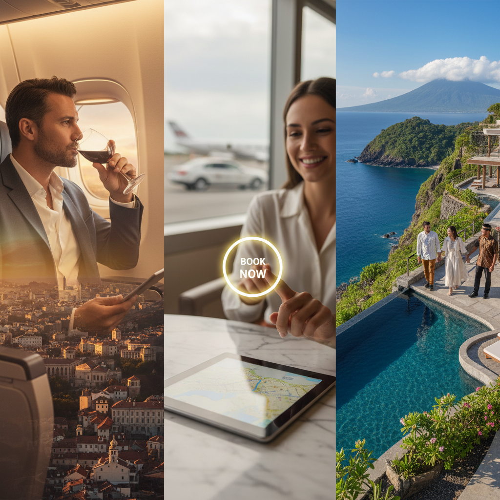
2. Visual Hierarchy: Exclusivity Through White Space
If your booking button looks like a generic bright-orange "Buy" button from an e-commerce site selling phone cases, you are commoditizing your brand. High-end travelers equate "clutter" with "cheap."
To optimize your travel website UX, you need to leverage the "Aesthetic-Usability Effect." Users perceive more aesthetic designs as more intuitive and trustworthy.
High-Contrast vs. Brand Alignment
Your button needs to "pop" within 0.5 seconds of a user landing on the page. However, it shouldn't clash. If your brand palette is deep navy and gold, a neon lime green button might get attention, but it will destroy the feeling of luxury.Gonzalo’s Growth Tip: Use "Negative Space" around your button. By surrounding your CTA with white space, you signal that this choice is important and exclusive. Look at Abercrombie & Kent; their CTA placement is minimalist and purposeful. It doesn't scream for attention; it waits elegantly for the guest to be ready.
3. Priming the Elite Impulse: The Eye-Scan Radius
Luxury bookings are rarely impulsive in terms of time, but they are absolutely impulsive in terms of emotion. To capture that emotion, you must build trust within the "eye-scan radius" of the button.
In tour operator CRO, we talk about the "Golden Triangle." This is the area where a user’s eyes linger right before they commit. If that space is empty, you are leaving the guest alone with their doubts.
Use "Trust Buffers"
Place high-authority social proof within inches of the button:- A 5-star TripAdvisor or Trustpilot badge.
- A small line of text: "Limited to 8 guests per departure." (Scarcity)
- "Flexible cancellation until 48 hours prior." (Risk Reversal)
4. "Book Now" vs. "Check Availability": The Psychology of Scarcity
One of the most common questions I get is: "Gonzalo, should I let them book instantly or make them request a quote?"
For high-ticket, inventory-scarce boutique tours, "Check Availability" is often more powerful than "Book Now."
Why? Because "Book Now" implies there is an infinite supply. "Check Availability" implies that the experience is so exclusive that you might already be too late. For a $15,000 private villa experience, the "Check Availability" button starts a high-touch conversation that allows your sales team to provide the white-glove service high-net-worth individuals expect.
5. Frictionless Flow: The "Mobile Elite" Mandate
Wealthy travelers are busy. They are booking $10k experiences while sitting in the back of an Uber or waiting for a flight. If they have to get up, find their wallet, and type in a 16-digit credit card number, you’ve lost them.
One-click isn't a luxury; it's a requirement.
Actionable Integration
- Apple Pay/Google Pay: These are essential for booking engine optimization. They remove the "wallet reach" hurdle entirely.
- Progressive Disclosure: Don’t show 20 form fields at once. Use a multi-step booking process that starts with something easy, like "Number of Guests."
6. A/B Testing: Your Data-Driven Edge
Never guess when you can know. Every brand’s audience reacts differently.
I recently consulted for a whale-watching operator in Iceland. We A/B tested a traditional "Book Now" button against a "Reserve Without Payment" button (capturing the lead first). The latter increased leur leads by 300%, and their sales team closed 60% of those leads.
The lesson? The button is the gatekeeper of your sales funnel. Test the color, the copy, and the placement relative to your hero image. If your button doesn't stand out against your background image, you are effectively hiding your cash register.
Conclusion: The Button is the Beginning
Stop viewing your booking engine as the "end" of your marketing. It is the most critical asset in your digital arsenal. Every pixel, every word of micro-copy, and every millisecond of load time on that "Book Now" button tells the guest what kind of experience they can expect from you.
If your button is clunky, generic, or confusing, they’ll assume your tour is, too.
Make the commitment as beautiful as the journey itself.
To your growth,
Gonzalo
---
Are you ready to stop leaving revenue on the table? If your website isn't converting the way it should, it’s time to stop guessing and start optimizing. Audit your "kill zone" today—refine your copy, simplify your mobile flow, and watch your booking volume soar.